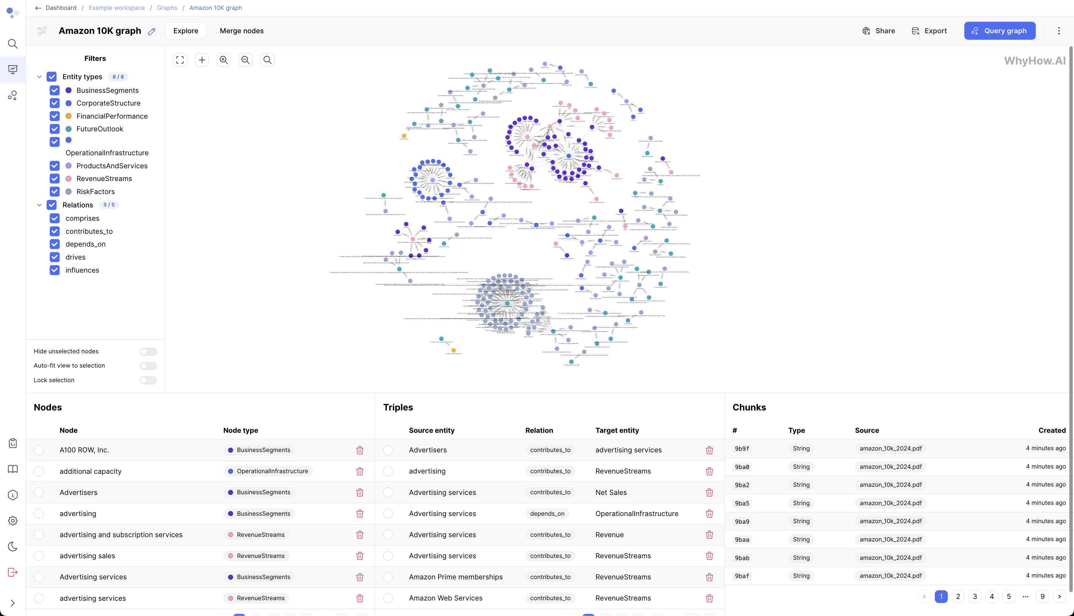
Graph Visualization
Graph visualization is a powerful feature in whyhow that allows you to explore and interact with your knowledge graph in a visually intuitive way. It provides an interactive interface to navigate through nodes, edges, and their properties, enabling you to gain insights and discover relationships within your data.
Accessing Graph Visualization
To access the graph visualization in whyhow, follow these steps:
- Open your workspace and select the project you want to visualize.
- Click the "Graph" tab in the project navigation menu.
- The graph visualization interface will load, displaying your knowledge graph.
Interactive Exploration
The graph visualization in whyhow offers various interactive features to help you explore and analyze your graph:
-
Zooming and Panning: You can zoom in and out of the graph using the mouse scroll wheel or the zoom controls in the toolbar. Panning allows you to move around the graph by clicking and dragging the background.
-
Node Selection: Clicking on a node selects it and highlights its connected edges. The properties and relationships of the selected node are displayed in the side panel.
-
Edge Selection: Clicking on an edge selects it and highlights the connected nodes. The side panel displays the selected edge's properties and details.
-
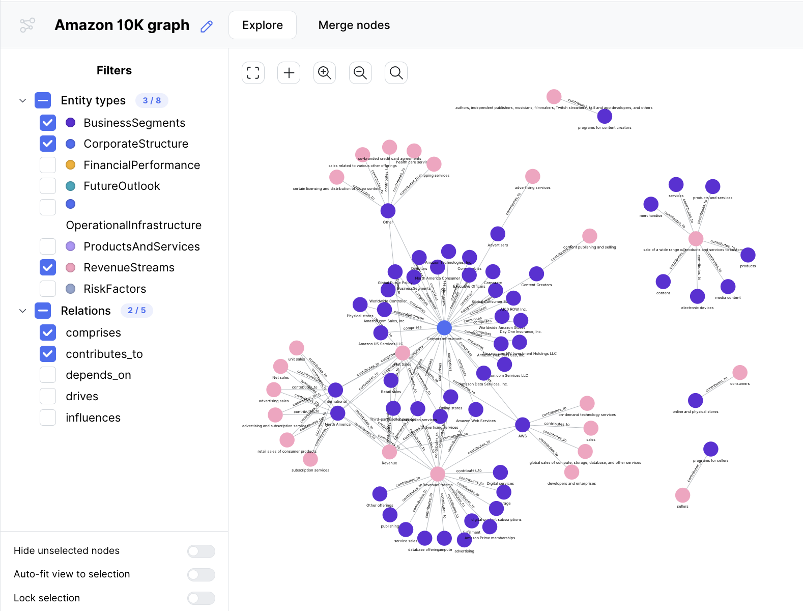
Filtering: You can filter the displayed nodes and edges based on various criteria, such as entity types, relationship types, or property values. The filtering options are available in the toolbar or the side panel.
-
Search: The functionality lets you quickly find specific nodes or edges by their labels, properties, or IDs.
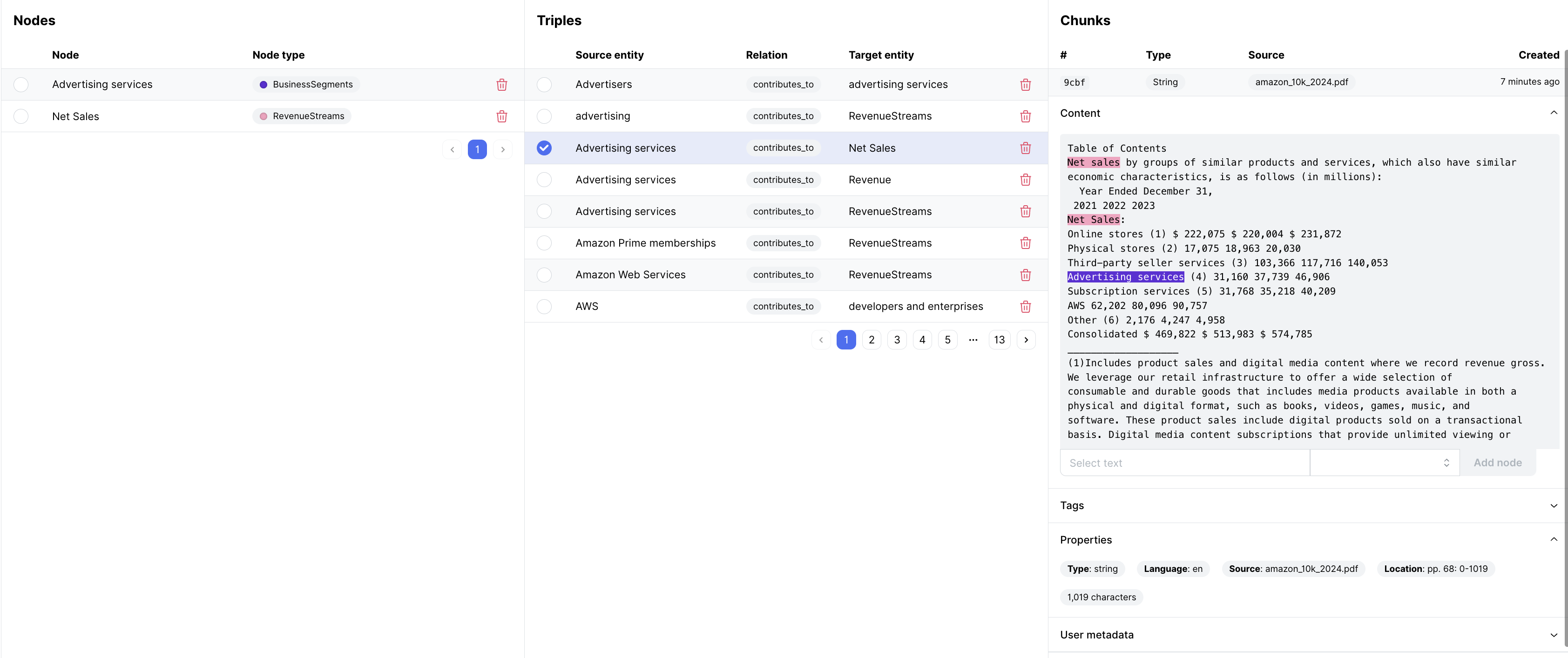
Nodes, Triples and Chunks
Within the graph view, you can also specifically navigate through the individual elements, all the way through to the chunks where the triples were extracted from. This provenance also highlights where in the text the extraction happened.
Exporting and Sharing
whyhow allows you to export and share your graph visualizations for further analysis or presentation purposes:
-
Cypher Export: All graphs can be exported to Cypher, allowing for interoperability with other platforms.
-
Sharing: You can share the graph visualization with team members or stakeholders by generating a shareable link or inviting them to your workspace with appropriate permissions.
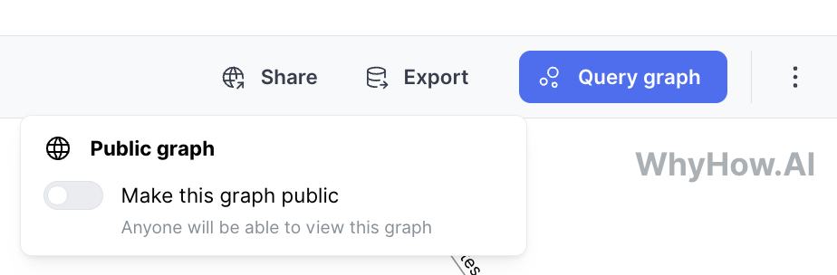
For example, see this one: https://app.whyhow.ai/public/graph/669fae15d5d2a66c2c46ffc8
Best Practices
To make the most of graph visualization in whyhow, consider the following best practices:
-
Incremental Exploration: Start by visualizing the high-level structure of your graph and gradually dive into specific subgraphs or regions of interest. This approach helps manage the complexity of large graphs.
-
Filtering and Focusing: Utilize filtering options to focus on relevant subsets of your graph based on specific criteria. This reduces visual clutter and allows you to analyze particular aspects of your knowledge graph.
-
Contextual Information: Leverage the side panel and tooltips to provide additional context and information about selected nodes and edges. This aids in understanding the properties and relationships of entities.
-
Collaborative Analysis: Share your graph visualizations with team members and stakeholders to facilitate collaborative analysis and discussion. Use interactive features to encourage exploration and insight generation.
By leveraging whyhow's graph visualization capabilities, you can gain valuable insights, identify patterns, and optimize the structure and relationships utilizing a knowledge graph.